take a look around

work.jpg

Which Type of Design?

or keep scrolling down to see it all


Identity Design

Jack’s Hacks

Logo for small IT business aimed at helping individuals with their various technologies and troubleshooting. Client wanted to incorporate his “Memoji” into the logo, which included “Air buds”. I used that as a way to tie the name with the image using the apostrophe.

The JBar Group, LLC

Logo for a legal recruiting company. The client wanted a logo that was clean, professional, and incorporated a legal element. In this case, the J and B along with the line/curve above them mimic a pillar that you would see in front of a courthouse or legal building.

The Brookland Group

This logo is for an employment recruiting company. The shapes symbolize both “windows of opportunity” as well as doors to new opportunities, which relates back to starting new jobs.

Little Bean Coffee

Logo for a NYC gourmet coffee shop. The client wanted something simple, friendly, approachable, and incorporated the aqua color as it was being used in the store decor.

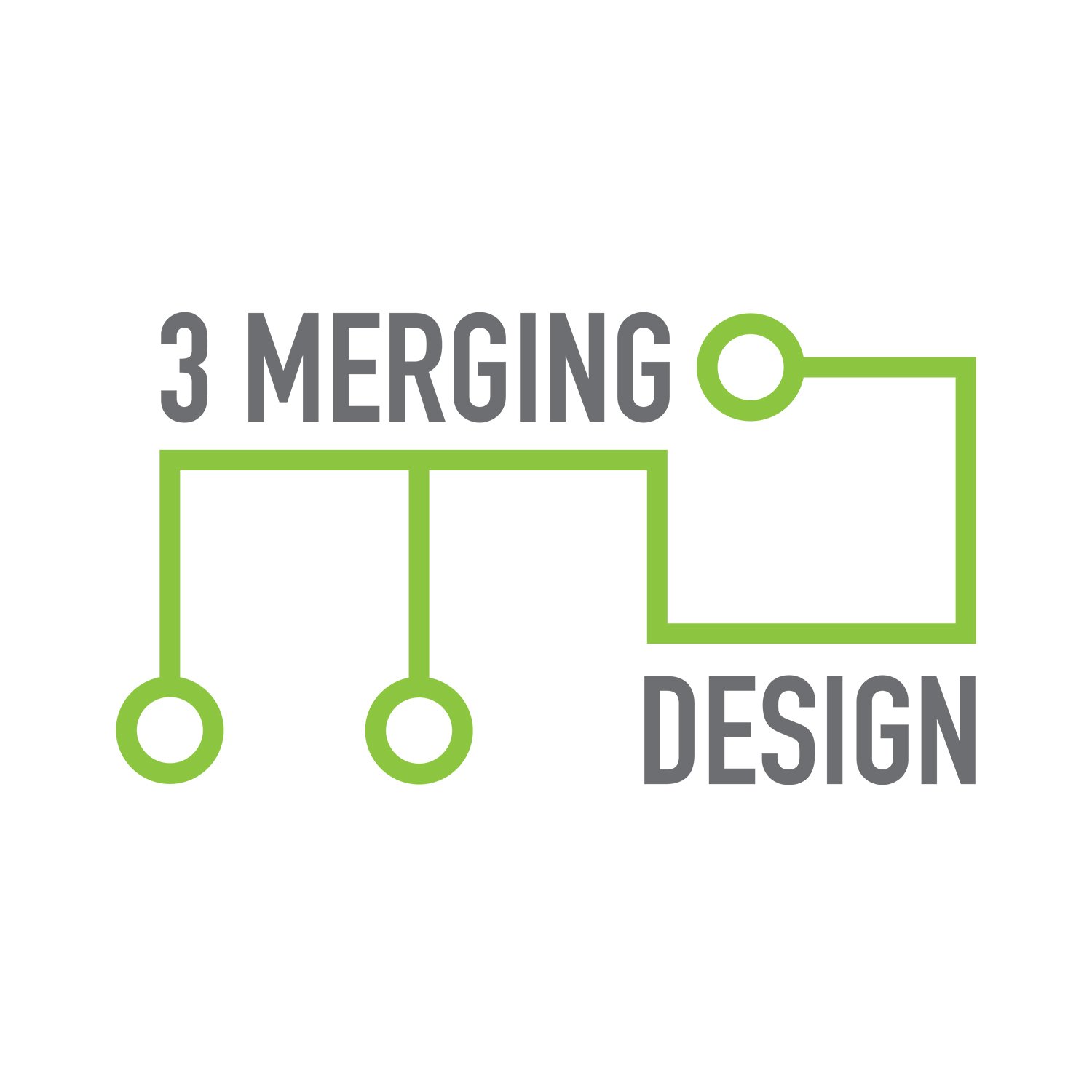
3 Merging Design

This logo was created for a technology company offering B2C services. The design of the logo incorporates circuit-like elements relating to technology while connecting the words and forming a “3”, “M” and “D” as well.

LMM Photography

Lifestyle photographer looking for a logo that was clean and simple, and one that she could place on all of her photos. I created 2 versions so she could have more flexibility in placement. It was important that the logo would not distract from the photo.

Family Dental Associates of NJ, LLC

Owner of family dental practice was looking for a logo that was approachable, for all ages, and clean. I wanted to create something friendly for the whole family without being too casual, while maintaining strong professionalism.

The Experience - An annual company event

A software company in the beauty industry wanted a new logo for their annual conference newly called, The Experience. The typeface was chosen to convey a technological, progressive feeling to represent the company itself—in software. The pink quarter starburst is an element from the company logo. I transformed it to a sketch to mimic the mission of the event—that it was an educational conference where you start with a sketch or an idea and from there, you learn and grow. It’s about the experience more than the result.

Julie L. Peters, Ph.D.

Women’s health psychologist in private practice was looking for a stationery identity set. She wanted her look to be feminine, professional, and clean.

EnergyHub

EnergyHub is an electric fuel company looking for a logo and stationery set. Its 3 core values—sustainability, reliability, and convenience—were the key elements in developing EnergyHub’s brand identity. The colors chosen represent those values, and the shape element is the shape formed when you overlap 3 circles—it’s the section that contains all 3 values. The overall feel of the identity is friendly, clean, and simple. It was important to develop a design that linked this welcoming and simplistic tone to EnergyHub’s nearby locations and reliable service. (Concept only)

EnergyHub

Stationery set. (Concept only)

Elastic City

Elastic City is a NYC-based walking tour that incorporates all of the senses. I developed this identity set to have a fun aesthetic, while choosing the typeface and design to mimic movement and sound. (Concept only)

Elastic City

Elastic City stationery set. (Concept only)

Millennium S.I. Brand Guidelines

I created this Brand Guidelines PDF for the entire company so that everyone could understand and utilize the correct logos, fonts, icons, and more in order to keep brand integrity and consistency throughout all company and client materials. This 32-page document covered correct and incorrect uses of their logos, minimum sizes and clear spaces, typography for various mediums, and color palettes.


Digital Design

Platinum Winner in the Hermes Creative Awards 2024

Deep Green eBook
This is an ebook that I designed for a Thought Leadership piece about how technology will drive sustainability in business. The stakeholders wanted bold, intense, and vibrant imagery in combination with a clean, light, and modern layout, while staying within brand guidelines. I also shaped the concept behind the imagery to show how technology and nature can interact and evolve. This piece became the template for future ebooks written by the Thought Leadership team.

Platinum Winner in the Hermes Creative Awards 2024

Deep Green eBook
Three spreads from the Deep Green ebook shown previously.

Deep Green eBook (series)

This piece is another eBook based off of the above Deep Green eBook. Also written by the Thought Leadership team, this ebook called for imagery and layout that was vibrant, bold, but also light and airy to make it enticing, inviting, and attractive. The topic of how sustainability and technology can work together to improve businesses and everyday lives was the theme for imagery.

Deep Green eBook (series)

Several pages from the eBook described previously.

Platinum Winner for both the Hermes Creative Awards 2022 and the MarCom Awards 2022
This customized landing page was designed and created to introduce and support the new brand launch for the company, which aimed at describing their capabilities and services in a unique and fresh way.

Platinum Winner for both the Hermes Creative Awards 2022 and the MarCom Awards 2022
Mobile version of the new brand landing page previously described.

The JBar Group Website

This 7-page website was created for a legal recruiting company who wanted a professional, friendly, and straight-forward look. Using SquareSpace, I was able to build and customize the site to fit their new brand identity and style. Click here to see live website.

The JBar Group Website

A couple interior pages of the previous website described.

Julie L. Peters, Ph.D. Website

This women’s health psychologist was looking for a simple, straight-forward website to complement her brand identity that I also designed. Having a feminine, elegant, and simple-to-read site was important to her.
Click here to see live website

SolHarvest Energy Website

I designed this website for a solar energy company, and worked with a web developer to have it function. Using colors and style from the company’s already established logo, I designed this site to be easy to understand, upbeat, and responsive.

SolHarvest Energy Website

A couple interior pages from the previous website described.

Millennium S.I. Company Website

I designed this corporate website as a complete redesign to include not just company information, but also product and event information as well. The prior website was not mobile-friendly either, so I developed and planned the site from sketch and wireframe to final design which included a gridded system so that it could be responsive, and worked with an outside web development company to get it to function. It involved a lot of planning, strategizing, and organizing of text, imagery, and videos, and I managed the team of developers to bring my design to life.

Garden State Modular Homes Website

This client was looking for a website to increase its customer base, but also to educate its prospects on the use, process, and benefits of modular home construction. In order to keep consistent with the company’s logo and brand, I designed the site to represent its main values focused on sustainability, efficiency, quality, and budget. This was especially achieved through the earthy tone palette, friendly typeface, as well as the use of the leaf element from the logo.

Garden State Modular Homes Website

A couple interior pages from the previous website described.